


Reimagining the public facing experience.
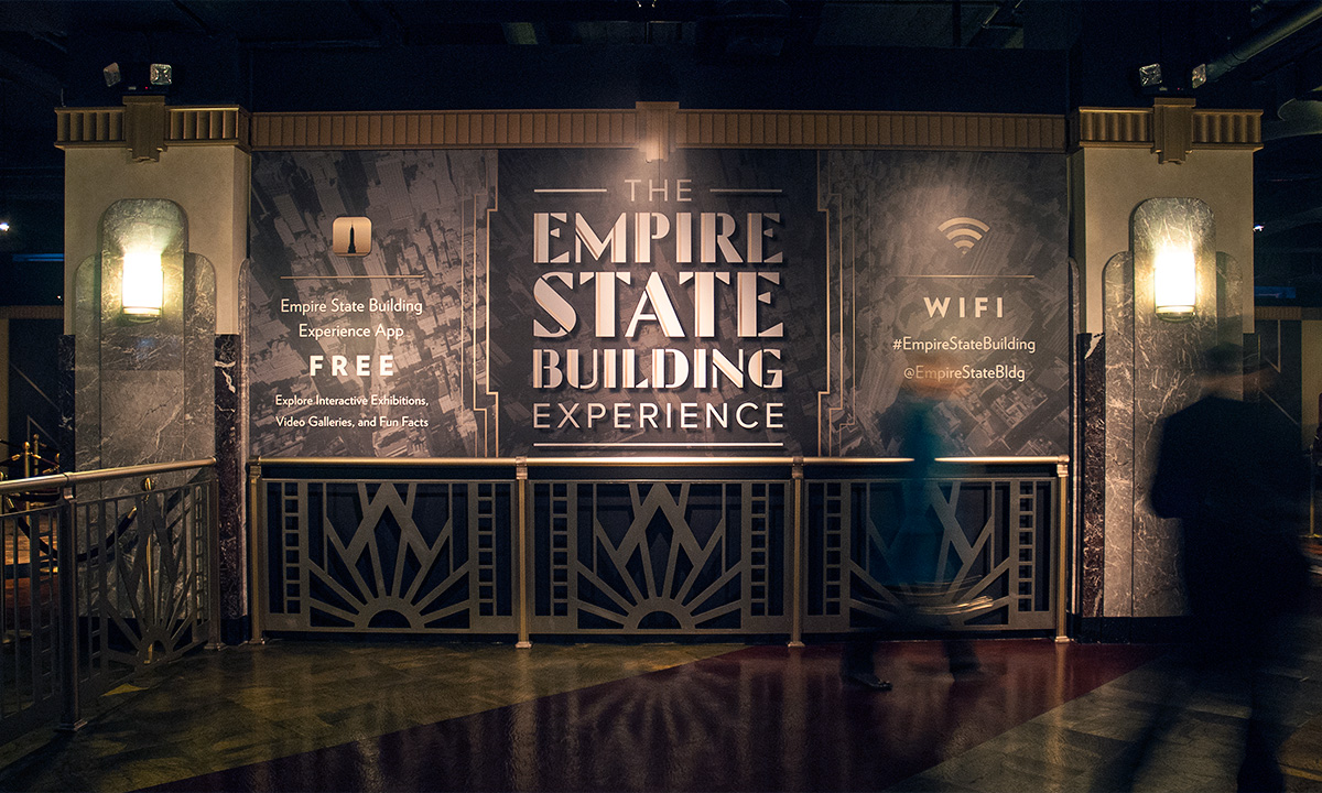
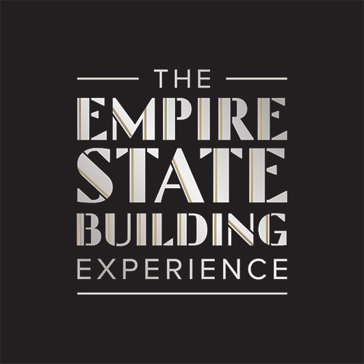
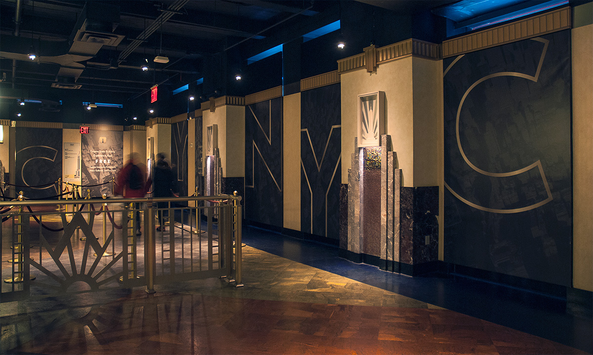
While at Poulin + Morris we created an environmental graphics program for the newly renovated space that refers to the building’s history while guiding the visitor to use 21st century technology. The Empire State Building Experience’s new visual identity and logotype align with the architectural language of the building’s Art Deco interiors. Guests are guided through each decision point, providing reassurance that they are moving correctly through the complex space.
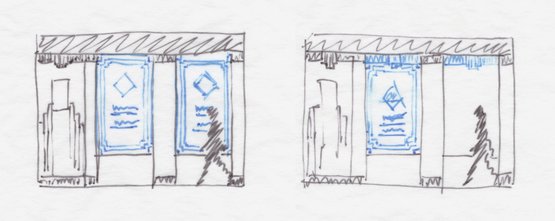
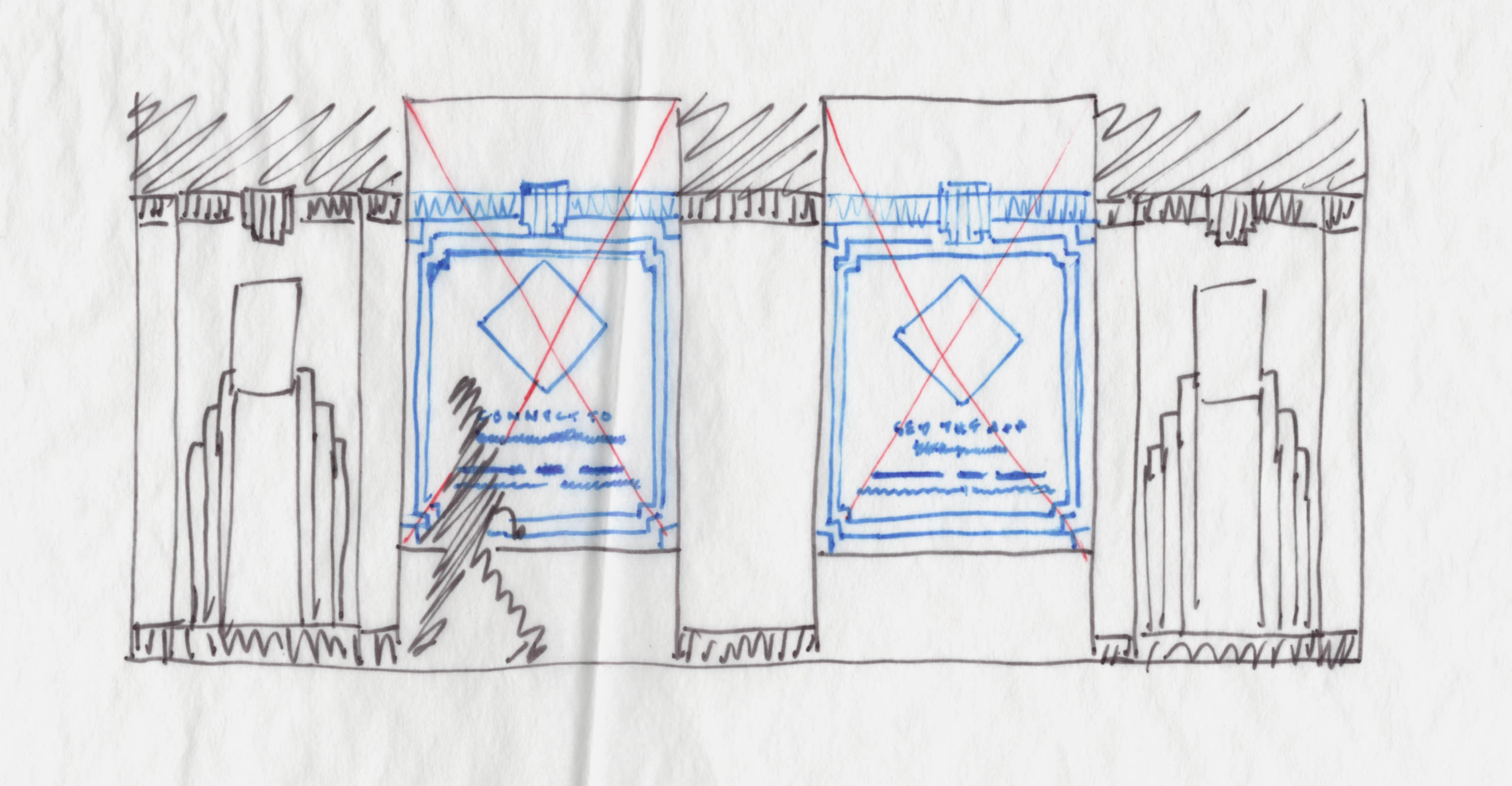
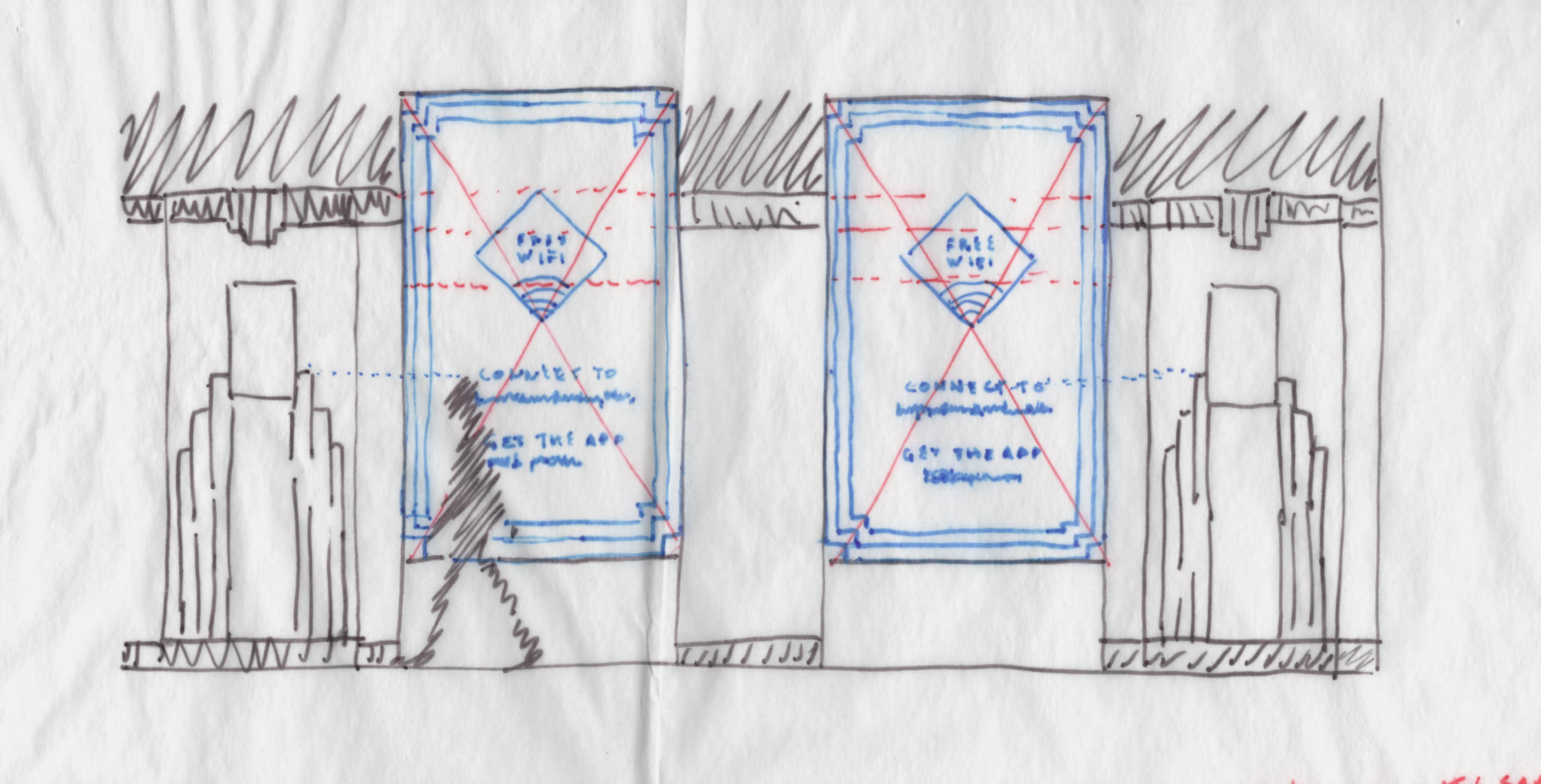
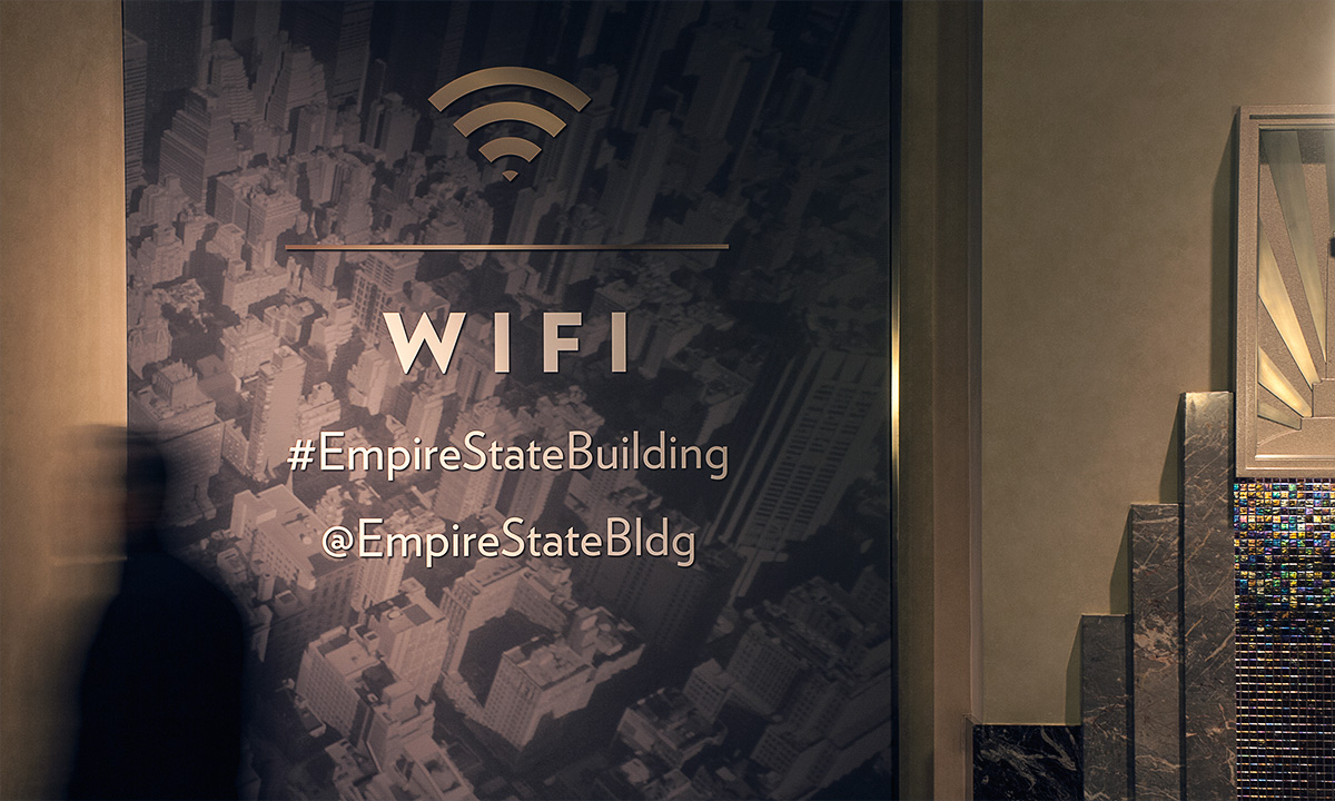
As visitors move through multiple lines on their way to the breathtaking views of New York City, they are encouraged to interact with the building online; the graphic murals provide information on wifi, hashtags and social media links to share all aspects of their visit.
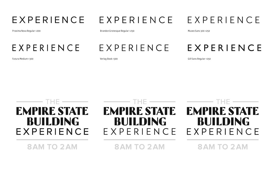
Our first step was to explore typographic options that blended well with the existing branded typeface, carried a similar architectural note and allowed a seamless integration into the new visual identity of The Empire State Building Experience.
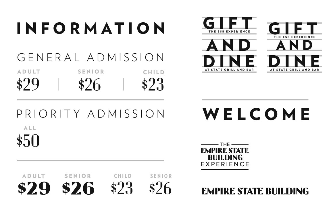
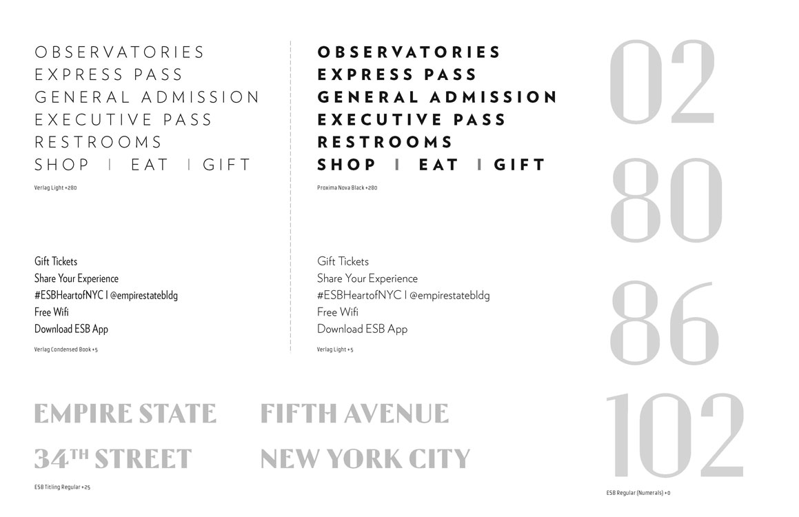
Once we explored branding and determined the best paired typeface, we began to explore how application of the newly developed branding and typeface pairing. Special care was taken to bring elements of the art deco architectural facade into the artwork as graphical elements. Symbols were also designed to match the pre-existing designs.
credit: Photography used is copyrighted by Poulin + Morris Inc. Work for this project was performed individually or as part of a team while on staff as a designer at Poulin + Morris Inc.